Unleash Your Creativity: Animating a Butterfly with CSS
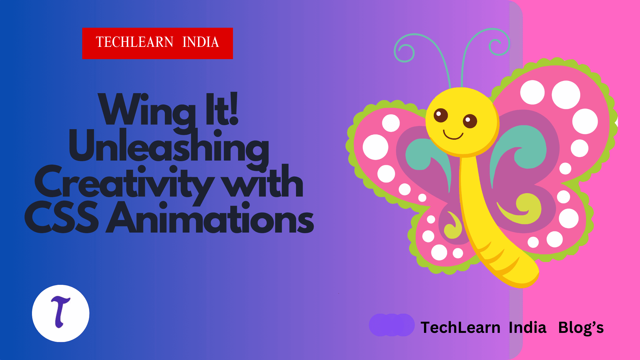
The world of web development is full of possibilities, and a touch of CSS magic can breathe life into static elements. Today, we'll embark on a creative journey – crafting a captivating butterfly animation that flutters across your screen!
The Code Canvas:
This project utilizes HTML to create the basic structure and CSS to define the styles and animation. We'll break down the code step-by-step:
HTML Structure:
The HTML code defines the basic structure of the animation:
There's a
<!DOCTYPE html>declaration at the beginning, specifying the document type as HTML.The
<html>tag is the root element of the webpage.Inside the
<html>, there's a<head>section containing the<title>element, which sets the title of the page to "Gaming Loader".The main content resides in the
<body>section.The body contains two main divs:
.bg: This represents a background circle..butterfly: This represents the butterfly with its wings, body, and antennae.
CSS Styles:
body{
    margin: 0;
    padding: 0;
    height: 100vh;
    width: 100%;
    display: flex;
    justify-content: center;
    align-items: center;
    background-color: #023047;
}


.bg{
    width: 150px;
    height: 150px;
    border-radius: 50%;
    background-color: #0077B6;
    position: absolute;
}


.bg::before{
    content: '';
    width: 150px;
    height: 150px;
    border-radius: 50%;
    background-color: transparent;
    border-right: 2px solid #0af;
    position: absolute;
    animation: rotate 2s ease-in-out infinite;
}

@keyframes rotate{
    to{
        transform: rotate(360deg);
    }
}


.butterfly{
    width: 200px;
    height: 200px;
    display: flex;
    perspective: 1000px;
}


.wing{
    width: 50%;
    height: 100%;
}

.wing.left{
    transform-origin: right center;
    animation: flip 2.5s ease-in-out infinite;
}

.wing.right{
    transform-origin: left center;
    animation: flip2 2.5s ease-in-out infinite;
}

.top-wing{
    height: 50%;
    width: 100%;
    border: 1px solid #0af;
    border-radius: 10% 100% 5% 40%;
    position: relative;
}

.top-wing.right{
    height: 50%;
    width: 100%;
    border: 1px solid #0af;
    border-radius: 100% 10% 40% 5%;
    position: relative;
}


.bottom-wing{
    height: 50%;
    width: 100%;
    border: 1px solid #0af;
    border-radius: 70% 2% 70% 2%;
}


.bottom-wing.right{
    height: 50%;
    width: 100%;
    border: 1px solid #0af;
    border-radius: 2% 70% 2% 70%;
}


.butterfly-body{
    height: 30%;
    width: 3%;
    margin-top: 40%;
    border: 1px solid #0cf;
    border-radius: 40%;
    position: relative;
    z-index: -1;
}

.butterfly-body::after{
    content: '';
    position: absolute;
    height: 20%;
    width: 210%;
    top: -25%;
    left: -45%;
    background-color: white;
    border: 1px solid black;
    border-radius: 35% 35% 0% 0%;
    z-index: 4;
}


.butterfly-body::before{
    content: '';
    position: absolute;
    height: 70%;
    width: 200%;
    top: -20%;
    left: -45%;
    background-color: white;
    border: 1px solid black;
    border-radius: 43%;
    background-color: #000;
    z-index: 3;
}

.antenna{
    position: absolute;
    top: -90%;
    height: 50px;
    width: 50px;
}


.antenna.left{
   left: -850%;
   border-right: 4px solid #0cf;
   border-radius: 0% 100% 0% 0%;
}

.antenna.right{
    left: 50%;
    border-left: 4px solid #0cf;
    border-radius: 100% 0% 0% 0%;
}


.antenna.left::before{
    content:'';
    position: absolute;
    left: 10%;
    top: -2%;
    height: 5px;
    width: 5px;
    border-radius: 50%;
    background-color: #0cf;
}


.antenna.right::after{
    content:'';
    position: absolute;
    right: 10%;
    top: -2%;
    height: 5px;
    width: 5px;
    border-radius: 50%;
    background-color: #0cf;
}


@keyframes flip{
    0%{
        transform: rotateY(0deg);
    }40%{
       transform: rotateY(90deg);
    }80%{
       transform: rotateY(0deg);
    }
}


@keyframes flip2{
     0%{
        transform: rotateY(0deg);
    }40%{
       transform: rotateY(-90deg);
    }80%{
       transform: rotateY(0deg);
    }
The CSS styles define the appearance and animation of the elements:
Body Styles:
margin: 0; padding: 0;: Removes default margins and padding from the body for better control.height: 100vh; width: 100%;: Sets the body to fill the entire viewport height and width.display: flex; justify-content: center; align-items: center;: Arranges the content of the body horizontally and vertically centered.background-color: #023047;: Sets the background color of the body to a dark blue.
Background Circle (
.bg):width: 150px; height: 150px;: Sets the size of the background circle.border-radius: 50%;: Creates a circular shape for the background.background-color: #0077B6;: Sets the background color of the circle to a lighter blue.position: absolute;: Positions the circle absolutely within the body, allowing it to overlap other elements.
Background Circle Animation:
.bg::before: Creates a pseudo-element before the background circle.content: '';: Ensures the pseudo-element doesn't display any text.Similar styles to
.bgare applied to create another circle on top with:border-right: 2px solid #0af;: Creates a thin white border on the right side.animation: rotate 2s ease-in-out infinite;: Applies a rotation animation that spins the circle infinitely.
@keyframes rotate: Defines the animation properties for the circle.to { transform: rotate(360deg); }: Specifies that the circle should rotate 360 degrees during the animation.
Butterfly (
.butterfly):width: 200px; height: 200px;: Sets the size of the butterfly.display: flex;: Enables flexbox layout for positioning the wings and body.perspective: 1000px;: Sets a perspective for creating a 3D flipping effect on the wings.
Wings (
.wing):width: 50%; height: 100%;: Each wing takes up half the width of the butterfly and spans the full height.
Left Wing Animation (
.wing.left):transform-origin: right center;: Sets the rotation origin point for the left wing to its right center.animation: flip 2.5s ease-in-out infinite;: Applies a flipping animation to the left wing.
Right Wing Animation (
.wing.right):transform-origin: left center;: Sets the rotation origin point for the right wing to its left center.animation: flip2 2.5s ease-in-out infinite;: Applies a flipping animation (named differently but likely similar) to the right wing.
Wing Styles (
.top-wing,.top-wing.right,.bottom-wing,.bottom-wing.right):These styles define the shapes and borders of the top and bottom wings for both left and right sides using properties like:
border: 1px solid #0af;(border color)border-radius:(rounded corners)
Butterfly Body (
.butterfly-body):height: 30%; width: 3%;: Sets the size of the butterfly body.margin-top: 40%;: Positions the body 40% down from the top of the butterfly.`border: 1px

BOOM!!!!!!!!!!😊😊😊😊
Learning to Code, Limitless Possibilities:
The beauty of this project lies in its simplicity and the vast potential for customization. With a basic understanding of CSS, you can create captivating animations like this butterfly and bring your web pages to life.
Looking to take your coding skills to the next level? TechLearn India offers comprehensive CSS courses designed to equip you with the knowledge and tools to create interactive and visually stunning web experiences. Explore their courses and unlock the power of CSS to turn your creative ideas into reality!
click this to explore your css journey with TechLearn India.
https://app.techlearnindia.com/css?coupon=LEARNING28